Social listening is a tactic that brands worldwide are using to monitor their online presence. Unfortunately, it’s extremely difficult to keep track of everything that’s being said about your brand and what it means for your public image. That’s particularly true for growing businesses that are generating more interest than they can manage.
In this article, we’ll look at the basics of social listening and how you can improve your social listening strategies through data visualization. Regardless of your niche or the scale of your business, you can almost always generate critical insights through the process of social listening.
What is social listening?
In short, social listening is the process of monitoring statements about your company on social media. That could include posts about your products, individual employees, or the experiences of particular customers. You’ll gain valuable information about your brand image with strong social listening practices.
Of course, manually keeping up with the latest social media posts isn’t always practical. Unless you’re a major international corporation, you probably don’t want to allocate resources to employees who spend all day refreshing their Twitter and Reddit feeds to find the latest mentions.
Over the last ten years, more and more companies have moved to dedicated applications that automate and streamline different aspects of social listening. For example, a social listening tool might be able to monitor relevant posts automatically or even grade them based on how they portray your brand.
How does data visualization improve social listening insights?
Since social listening is usually mediated through software, how you visualize that information is extremely important. A reliable social listening platform will be able to cut through the noise and present you with clear takeaways that you can use to fully understand your brand image.
A very small business might be able to read and respond to every social media post related to their brand. In that case, there’s no need for data visualization – the marketing team will already be familiar with all the relevant content.
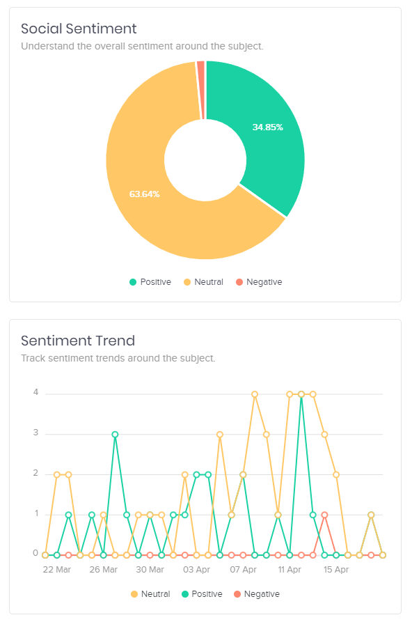
Once you start generating more social media interest than you can keep up with, you need to condense the posts themselves into clear data. This could be as simple as measuring the percentage of positive, negative, and neutral posts so that you understand how your brand perception is changing over time.
How to visualize data for social listening
The example above is practical on its own, but you’ll need more than a basic positive/negative/neutral pie chart to build up your data visualization practices. In this section, we’ll review some of the most effective data visualization tactics digital marketers should know in 2022.
1. Line graphs for changes over time
Understanding where your brand is right now is crucial to social listening. At the same time, it’s at least as important to identify the key trends that are driving changes in your brand perception. Even if you aren’t getting the desired results, a positive trend indicates you’re on the way.
Line graphs are a highly effective method of visualizing changes in data over time. For example, you could do something as simple as plotting the number of social media mentions your brand generates daily. Here are a few questions you might be able to answer with this kind of line graph:
- Is engagement increasing or decreasing?
- What days of the week are best for engagement?
- Did engagement spike in response to specific posts or campaigns?
If you notice clear increases in particular days or weeks, this is a good sign that you should continue returning to the strategies you were using then. While social media mentions can fluctuate for reasons outside your control, you always want a positive trend line that shows engagement going up over time.
Keep in mind that you need to perform at least some competitive analysis to take full advantage of the insights of a line graph. For example, you would be happy to see a spike around Black Friday on your own graph. On the other hand, this might not be a good sign if it turns out that other brands experienced a much greater increase in engagement than you did.
2. Pie charts for market share
As mentioned, social listening isn’t complete without thoroughly considering your competitors. Pie charts are a good way to cut through the noise since they focus on your share of the market rather than the pure amount of engagement.
An effective social listening tool will provide detailed pie charts for various aspects of social media engagement you may be interested in. In the Oktopost screenshot below, the pie chart simply shows the percentage of mentions generated by four major brands in the same niche. However, mentions alone won’t tell you the whole story.
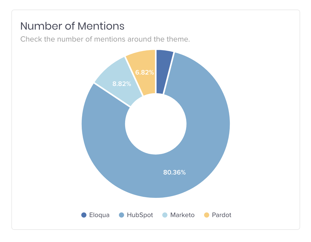
Metrics like impressions, engagement per post, and number of unique authors (vs. duplicates) are just a few of the most important figures to be aware of.
For example, even if you’re generating more total mentions than a competitor, they might be getting more engagement on specific types of posts that you aren’t using. Remember that you can learn from the strategies of your competitors even when you’re already outperforming them in certain areas.
3. Bar graphs for follower count
When it comes to platforms like Twitter and Instagram, follower count is the simplest way to evaluate your audience and total reach. However, it’s critical to understand that not all followers are created equal.
It’s always good to have users who follow your brand and regularly share your posts, but they won’t be able to do much if they only have ten followers of their own. On the other hand, a single share from someone with thousands of followers could immediately impact your brand recognition.
With that in mind, you should focus more on connecting with high-value followers than simply increasing your raw follower count. A bar graph showing subsets of your followers by their own follower counts will give you an idea of how successfully you’re connecting with this key audience.
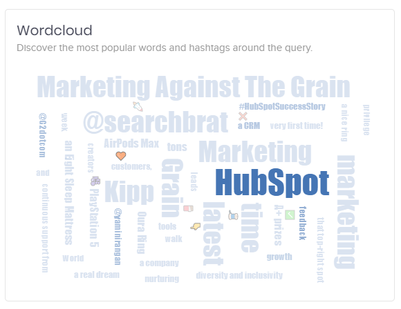
4. Word clouds for engagement analytics
The proportion of positive, neutral, and negative comments is crucial information for any brand, but it doesn’t say much about your social media feedback content. To fully understand your image, you need to know what is leading different users to have different images of your brand.
For example, you might not think you have much to worry about if just 10% of your brand mentions are negative. However, it could be that most of that group is frustrated by a simple, easily resolvable issue. With a basic positive/neutral/negative breakdown, you won’t have the information you need to improve their experience.
On the other hand, word clouds dig deeper by highlighting the most common words used in mentions of your brand. When you know more about the positive, neutral, and negative brand mentions on social media, you’ll know how to build on your strengths while shoring up your weaknesses. This is much more helpful when it comes to identifying specific goals.
Final thoughts
Social listening is one of the most important resources available to modern companies. However, you won’t be able to fully leverage the value of social listening unless you’re able to synthesize the underlying information through data visualization. After all, data is great – but knowing what to do with it helps you scale your efforts.
Want to learn more about how social listening can boost your B2B brand? Book a demo with Oktopost today!