Say hello to the new Oktopost
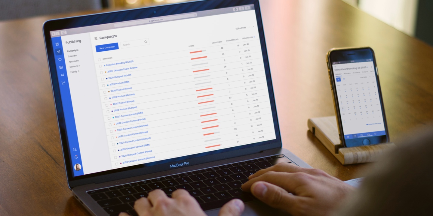
Table of contents
From day one, Oktopost has been constantly evolving. We add new features almost every week. So once in a while, the platform outgrows its user interface, meaning that the current design can no longer comfortably accommodate changes without affecting the app’s usability.
2019 was a great year for us in terms of adding new features to the platform, such as Approval Workflows. However, we also realized that it was time to rethink our user experience.
What has changed
First, we’ve redesigned the navigation to allow users to move faster and more freely across the platform.

New & old UI
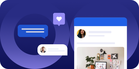
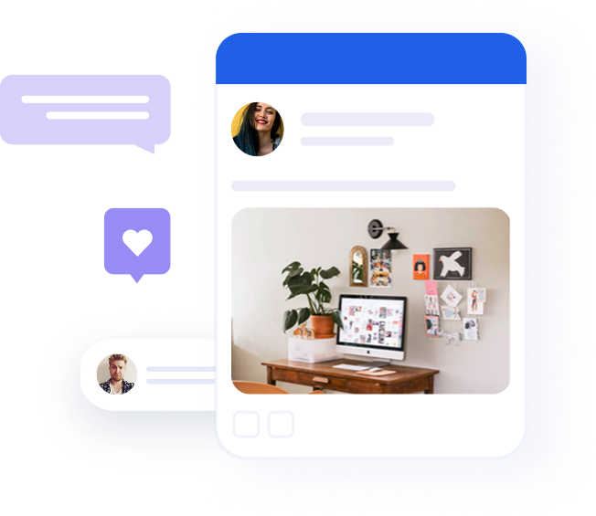
Another thing that needed to happen is a refresh for the platform look and feel. Our new branding, that you’ve already seen on the website and in the marketing materials, now is also reflected in the UI.
Most of our users spend at least a couple of hours inside the platform daily, and we want to make this time enjoyable. Yes, we’re B2B, but we still design our product for people, not faceless companies – and every personal experience counts.
Navigation
In feature-packed applications like Oktopost, navigation is an integral part of a user experience that enables successful interactions with the product. Our old navigation was designed for a much simpler platform than what Oktopost has grown into – so some paths and menus weren’t exactly aligned.
We’ve moved the submenu, user profile menu, and notification center from the top of the screen to the sidebar, next to our main menu. This cleans up the rest of the screen for a focused, uninterrupted working environment.
“One of the key concepts of UX design is to use patterns that people already know. We didn’t want to invent new things that might disrupt the user’s natural behavior. It’s the opposite, actually. You can find left-side navigation in so many apps today, it’s familiar. And this familiarity is exactly what we aim for.” – Noya Bar Guy, Product Designer at Oktopost
The best part about our new submenu is that it expands and collapses, leaving even more real estate for the Oktopost features. We’ve also added tertiary navigation to the sidebar as an accordion menu. Now, at any given moment, you know exactly where you are and how to get to somewhere else quickly.
That said, we left horizontal tabs inside the Campaigns and Advocacy modules (which feature asset lists) for the ease of traversing between each asset’s settings.
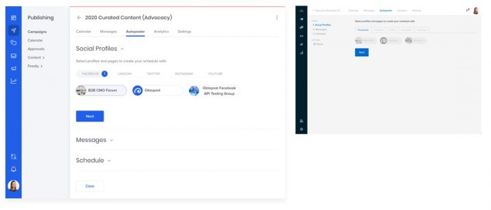
Autoposter: New & old UI
“No one likes changes. But we didn’t want to keep the old UI just because people got used to it, we wanted to make it better. I believe that it will be an easy transition for our users because the new interface organizes the platform features in a more intuitive way.” – Noya Bar Guy, Product Designer at Oktopost
Recommended for further reading
Oktopost design system
Together with the new UI, we’ve created the Oktopost design system, a set of reusable components and standards that can be utilized to build all future elements of the interface. Many tech companies have their own design systems, and it was about time for Oktopost to get one too.
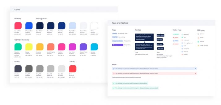
Elements of the Oktopost Design System
A design system’s purpose is to ensure a consistent and cohesive user experience across the platform. It includes detailed instructions regarding the use of colors and fonts as well as ready-made design components (buttons, forms, lists, tables, etc.) for every possible state.
For the design team, it was a project on its own. But our design system wasn’t created just for the sake of order, it actually is an extremely practical move.
One of the main advantages of having a design system is how it affects the production cycle. With all design elements ready at hand, our developers can reuse code and build an interface for new features much faster. And for the design team, it removes unnecessary, uncreative work of making the same thing over and over.
Time to switch
They say product design is never final, but our new UI is finally here. We will keep updating and tweaking things as we go: with a new interface and design system in place, this process will run faster and smoother.
If you haven’t switched to the new UI yet, we hope this post will convince you to give it a try. We’d love to hear your feedback.