
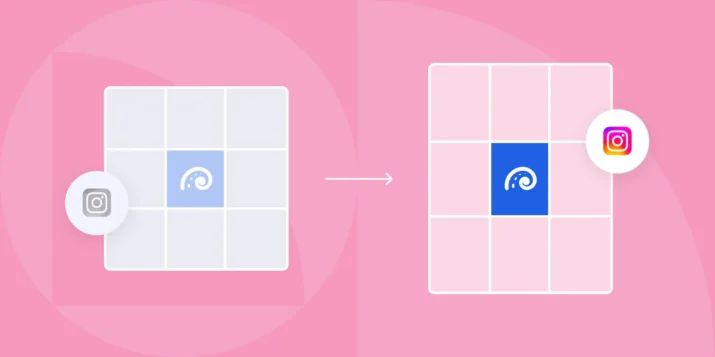
Instagram moved from the classic 1:1 square grid to a taller format in early 2025. If you manage an Instagram account for a B2B brand, you need to know the current grid dimensions, how aspect ratios behave across the profile grid and the feed, and how to design a cohesive layout that holds up over time.
This guide covers all of it, with the official specs straight from Instagram’s Help Center.
Instagram grid size at a glance
The profile grid now displays thumbnails at a 3:4 aspect ratio instead of the old 1:1 square. Here are the current dimensions you need to know:
| Content type | Upload size (px) | Aspect ratio | Grid thumbnail |
|---|---|---|---|
| Feed photo (portrait) | 1080 x 1350 | 4:5 | 3:4 crop |
| Feed photo (square) | 1080 x 1080 | 1:1 | 3:4 crop (letterboxed) |
| Feed photo (landscape) | 1080 x 566 | 1.91:1 | 3:4 crop (heavy letterbox) |
| Carousel post | 1080 x 1350 | 4:5 | 3:4 crop of first slide |
| Reel | 1080 x 1920 | 9:16 | 3:4 crop of cover image |
| Story highlight cover | 1080 x 1920 | 9:16 | Circle crop (161 x 161 displayed) |
Key takeaway: the 4:5 portrait format (1080 x 1350 px) gives you the most control over how your content appears both in the feed and on the profile grid. Square posts still work, but they will be letterboxed with padding on the grid.
Aspect ratios for the profile grid vs the feed
The profile grid and the feed behave differently, and that distinction matters for B2B brands that care about visual consistency.
In the feed: Instagram displays your image at whatever aspect ratio you uploaded, from 1.91:1 landscape all the way to 4:5 portrait. The feed respects your original framing.
On the profile grid: every thumbnail is cropped to 3:4 regardless of the original aspect ratio. That means:
- A 4:5 portrait image loses a thin strip from the sides.
- A 1:1 square image gets padded top and bottom, or you can manually reposition the crop.
- A landscape image loses significant area on both sides.
- A 9:16 Reel gets cropped to 3:4, cutting the top and bottom of the cover.
This is why Instagram for B2B marketing now demands more intentional design. You cannot rely on one dimension to look good everywhere.
Practical rule: design for 4:5 (1080 x 1350) and keep critical elements (logos, text, faces) inside a centered safe zone of roughly 1012 x 1350 px. That inner area is what survives the 3:4 grid crop.
Designing a cohesive 9-tile grid
A well-planned 9-tile grid (the first three rows of your profile) creates an immediate impression of your brand. For B2B companies, this is often the first visual touchpoint for prospects who click through from a LinkedIn post or an email signature.
3×3 brand story, color blocks, text on image safe zones
There are three common approaches to a 9-tile grid:
1. Brand story layout
Plan your next nine posts as a single visual narrative. Each tile is an individual post, but together they tell a story about your product, a campaign theme, or a customer outcome. This works well for product launches and events. Map out all nine tiles in a design tool like Figma or Canva before publishing anything.
2. Color block pattern
Alternate between two or three brand colors across tiles to create a checkerboard or row-based pattern. This is low-effort to maintain and produces a clean, recognizable grid. Pick colors from your brand palette and assign them to categories (for example, blue for product posts, white for customer stories, dark gray for data insights).
3. Text-on-image safe zones
If your grid includes text-heavy graphics (quote cards, stat callouts, tips), keep all text within the center 70% of the image. The outer edges are at risk of cropping on the 3:4 grid thumbnail. Specifically:
- Keep text at least 34 px from the left and right edges (for the 4:5 to 3:4 side crop).
- Avoid placing text in the top or bottom 135 px of a 9:16 Reel cover.
- Test every graphic by previewing it as a 3:4 crop before scheduling.
For B2B brands, a consistent grid signals professionalism. When a prospect visits your Instagram profile after reading about building your Instagram presence, the grid is what convinces them your brand is active and credible.
Grid templates you can reuse
You do not need to design every grid from scratch. Here are three reusable template structures that work for B2B Instagram accounts:
Template 1: The alternating row
Row 1: Photo, Graphic, Photo. Row 2: Graphic, Photo, Graphic. Row 3: Photo, Graphic, Photo. This keeps the grid visually balanced without requiring complex planning. Each “Graphic” slot can be a branded quote card, a data point, or a product tip.
Template 2: The column theme
Column 1 (left): always a product screenshot or demo clip. Column 2 (center): always a customer quote or testimonial. Column 3 (right): always a thought-leadership graphic or industry stat. Post in cycles of three to maintain the column structure.
Template 3: The 9-tile campaign burst
Dedicate all nine tiles to a single campaign (webinar promotion, product launch, event recap). Design them as a connected visual. After the campaign, archive the tiles or let them naturally scroll off the first three rows as you publish new content.
All three templates work with the 4:5 upload format. When creating content, design at 1080 x 1350 px and preview the 3:4 grid crop to make sure nothing essential gets cut.
If you use Instagram Stories for B2B alongside your grid posts, keep Story highlight covers consistent with your grid color scheme for a unified profile appearance.
Common Instagram grid mistakes B2B brands make
These are the most frequent grid problems we see on B2B Instagram accounts:
1. Ignoring the grid crop entirely
Posting images without checking how they will appear as 3:4 thumbnails leads to cut-off logos, cropped headlines, and awkward framing. Always preview the grid thumbnail before publishing.
2. Mixing too many aspect ratios
Switching between square, portrait, landscape, and Reel covers without a plan creates a chaotic grid. Pick one primary aspect ratio (4:5 is the safest) and stick with it for at least 80% of your posts.
3. Forgetting Reel cover design
Reels default to a frame from the video as the cover. If you do not set a custom cover image designed for the 3:4 grid crop, your Reel thumbnail will look random on your profile.
4. Over-designing the grid at the expense of individual posts
A grid that looks like a single image split into nine tiles is impressive once, but each post also needs to perform on its own in the feed. Make sure each tile has standalone value as a post, with a clear visual and caption.
5. Neglecting consistency after the first nine tiles
Many brands plan the first nine tiles carefully, then abandon the pattern. The grid is a rolling display. Plan in batches of three (one row at a time) to maintain consistency.
For more on combining visual content with the right tags and formats, see our guide on Instagram videos and hashtags.